Graphic Porn IV- Pimp my Graph (or not)
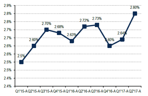
The first potential offenders—grid lines and chart labels—might not seem like special effects, per se, but they are often superfluous. In the example below, there are grid lines, each data point is labelled, AND every axis tick is fully articulated, to the extent that x-axis text is pretty much a run-on sentence. And never mind that that y-axis has a rounding issue masquerading as a stuttering impediment!
Lots o’ labels
In general, such extensive delineation is only necessary if the graph needs to serve as a lookup table. This would be the case if the reader needs to pay attention to the specific values of the variables, rather than the overall tendencies in the data. If the point is just to show, for example, how friendly a trend is then all those labels are a distracting turn-off. But even if those values are important, it is only necessary to delineate them once. Label the axis OR the data points. Also, if things begin to look cluttered, minimize the granularity of the labeling and provide the specificity in an accompanying table. That way the graph itself can leveraged for its true strength- visual information.
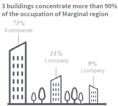
Sometime, however, in our attempts to simplify (good!) a graph or get artsy with the design (bad!), we might resort to using images or pictures in lieu of data points. Take a look at the example below. Typically, as in this case, the designer leverages relative sizing of the pictures to serve as a visual shorthand for the data variation. In this case, the stick figure houses are sized differently in an attempt to convey the percentages- 73%, 11% and 9%. But if you take this approach, be wary of what Tufte terms the “lie factor.” This is the extent to which the figures or icons are not truly proportional representations of the real data (think Barbie doll anatomy). The “lie factor” produces offenses like the one below. I haven’t gotten my ruler out and done the math here, but I’m guessing these buildings are not drawn to a scale that actually represents 73%, 11% and 9%. As a result, rather than illuminate data, this graph distorts it.
Size distortion
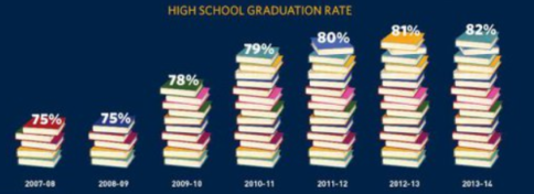
Creativity in design does have its place in graphing, but be cautious that you do not obscure or distort the data. The example above is drawn two-dimensionally; be especially cautious when employing 3D and perspective effects. In the example below, the three-dimensional books distract us from the disappearing y-axis origin (see previous post), making the data change appear larger than it really is. If the graduation rate percentages were plotted down to 0%, the change between 75% and 82% would not appear as significant. Our visual sense of the data variation is being manipulated.
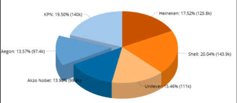
Pie charts are often the worst offenders in the pseudo-3D distortion category: The application of perspective distorts the visualization of the relative pieces. Don’t add a third dimension to flat data just because your software lets you.
Screwing with 3D effects
We are all familiar with the size distortions that occur in the far northern/southern landmasses when the world (which exists on a non-Euclidian spherical surface) is projected onto a two-dimensional map. That phenomenon is similar in nature to what’s happening here with these pseudo-3D pie charts. The difference is that here we are subjecting our happily flat Cartesian data graphs to the opposite distortion by unnecessarily pasting them onto a 3D image.
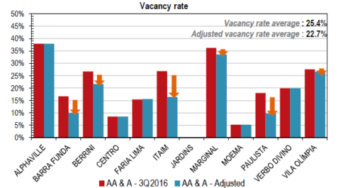
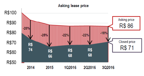
Lastly, let’s look at the category of graphical distractions. As a general rule, be careful with any added decoration. Ask yourself, “Am I diminishing the data with gaudiness or truly adding clarity?” In the example below, I’m not sure what the day-glo orange arrows are supposed to prompt—other than a strong desire for a gray-scale printed copy. Blue, red, and orange, mmmm. Moreover, a well-designed graph shouldn’t require an entire quiver full of arrows to point out highlights for the reader. The data alone ought to be able to speak for itself.
Distracting decoration
And… just when you thought you’d recovered from the previous eye strain afterimages, I hit you with the following:
Yowsa! Rule of thumb: Just say “no” to visual fill patterns. Most tend to induce seizures. Another important tip from Tufte: Always consider how much ink your graph would require to print. If your data/ink ratio is greater than one, you might want to have a think about what you’re trying to accomplish, besides potentially upping sales for toner cartridges.
So, I hope you’ve enjoyed our gallery of amusing examples of graphs gone wrong, but the key point is to take some time to get to know your data better. The better you understand the story the data is telling, the more effectively you will be able to be able to design a compelling presentation of it. Always remember the purpose of a graphic is to show things at a glance that are not easy to convey in text. Graphs can be informative and sexy (at least this math geek thinks so), but should not be exploitative exposés nor wastes of space.
If you’d like some additional pointers on good technique, check out this recent post by a favorite blogger of ours and fellow Tufte fan, Eugene Wei. Or you can just head right to the definitive manual itself:
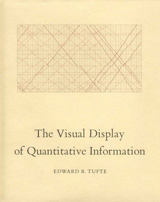